June 22, 2011, 9:40 pm - James Farrer
At work we've been talking about putting together a new homepage and layout for the main university website and separately the department website that I work on. For a while now I've been wanting to make some changes to the layout of this site to make it a little easier to use. There are some confusing links, formatting that doesn't differentiate the pieces of content well, and very poor mobile support.
The proposed design for the new BYU website uses CSS media queries that essentially check the width of the browser and apply a different stylesheet. I thought this was pretty cool so I started looking into it some more and at this point, it has to be the best mobile support method I have come across.
With many mobile sites, there is some sort of redirect to a mobile friendly site, often a subdomain of m.companysite.com. This is great except that only about half of the sites that do this actually preserve links that point at the site so if you click on the link in an email or somewhere else, you end up at a scaled down set of content that has nothing to do with what you came there for. The idea of having a separate mobile site never quite made sense to me because you are causing a significant amount of extra work to maintain two complete layouts and in some cases, completely different content.
One alternative is to set things up so they squish when resized. When I last played with the layout for this site that is essentially the path I chose. It scales alright on a desktop and most of the time the content is where it should be, though occasionally things are getting cut off or just look funny. On a mobile device it has to scale it down and then you are doing the pinch and zoom, pan and scroll game. Not too fun, especially when you're trying to create content. Another downside to this method is that the width of the site is fluid which means on wide screens, paragraphs can stretch a long ways and become difficult to read. Some sites use fixed width, which works for a news article, but not for a photo gallery. I have both...
The CSS media queries gives an interesting combination. By switching out the stylesheets you can accomodate for narrow widths without affecting the wide ones. If you're careful with your HTML and use more CSS to do the formatting you can completely rearrange a menu structure simply with the stylesheet. This means the content is exactly the same. No dual site maintainance, no more squishy sections (at least not if you don't want it).
I'm not sure that this was possible to do until recently. More recent browsers are supporting a lot of the CSS features more consistently now which makes this actually work. When I first started playing with mobile access, phones didn't have the ability to run most javascript, but now, they can do most things and even the desktop browsers are getting much more compatible and reliable in how they format things.
In short, I've got a functioning improvement to the stylesheets and layout of the site. I'm not very good at some of the finer designer details so I'm just applying the new stuff since it's functional and I'll fix the rest as we go. So if you see some gray, don't be scared ;-).
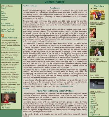
Old site layout:
Now go ahead and try to resize the site. Watch it work and give me some feedback.

