The Flavor is Here!
July 22, 2011, 11:21 pm - James Farrer
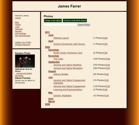
I finally got some color and life breathed into the new layout. I got some ideas from my wife and daughter which helped get things rolling. It's always a work in progress but I think it's a good improvement over anything I've done before. I think I still want to make some changes to the header section to make it a little less drab but I'll have to think on that for a bit.
As I was working through the process I discovered the ability to add multiple background images (comma separated in the CSS tags) that apparently is new in CSS3.
I was also introduced to the drop shadows as done in CSS and was surprised at how easy it was and how good it looked. I did run into a challenge with the shadow overlapping the other content blocks. It was fairly confusing. I believe most of it has to do with the way I am using floats to do the layout. Floating the sections is certainly not the only way to do it but it made it so when there is the third column in the smaller layout I can drop it back to the left under the other menu. The example that I got the base for the layouts from used a mix of floats and fixed positioning and I ended up moving more entirely to floats for the main sections.
I tried using z-index to force the order on the content boxes but at most I could affect one section, and never the right ones in the right order. I ended up just avoiding it for now by making the shadow fit into the margin width so it doesn't overlap the content. I had to adjust some of the margins to get things to fit in the right places. This was probably a good thing anyways to make it more consistent.
Here's an example of the narrow 2-column layout. Click to see the old look and feel and the new at various sizes.

